
IMPACT: COMMUNITY CHOICE PEDIATRICS
From Three Identities to One Clear Brand
Each practice had earned trust within its community and built strong relationships with patients over many years.
As the organization grew, however, a new challenge emerged.
Patients, referral partners, and even employees often struggled to understand the relationship between the three practices.
The organization was operating as one business while presenting itself as three separate brands.
Engagement Focus:
Brand Positioning • Naming • Identity System • Marketing Strategy
The Challenge
The challenge wasn’t awareness.
The practices were well-known within their communities.
The challenge was clarity.
Three brands were telling three different stories while leadership was working to build one organization.
This created confusion in the marketplace and made future growth more difficult than it needed to be.
Patients often viewed the practices as unrelated organizations.
Marketing efforts were fragmented.
The organization lacked a unified identity capable of supporting its long-term vision.
Leadership recognized that continuing to operate under multiple brands would create increasing complexity over time.
The question became:
How do we create one brand that honors the past while supporting the future?

The Decision
Before redesigning a logo or launching a new website, leadership needed to make a strategic decision.
Should the organization continue managing multiple brands?
Or should it create a single identity capable of unifying patients, employees, providers, and stakeholders?
The decision carried significant implications.
A unified brand would simplify communication, strengthen recognition, and create a clearer foundation for future growth.
The challenge was creating a brand that people could rally around while preserving the trust that had already been established within each practice.
Our Approach
We worked closely with leadership to clarify the organization’s vision, values, and long-term objectives.
Through discovery, positioning, and naming workshops, we explored how the combined organization could be represented through a single brand.
The engagement included:
- Brand positioning and strategy
- Naming development and evaluation
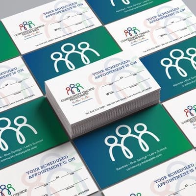
- Identity system design
- Messaging and brand architecture
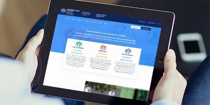
- Website strategy and development
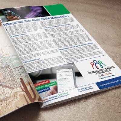
- Marketing and communications guidance
The objective was not simply to create a new identity.
It was to create alignment across the organization.
Every decision was designed to support a single, unified story.
The Result
Community Choice Pediatrics emerged as a clear, unified brand capable of representing the entire organization.
Patients, providers, employees, and stakeholders gained a simpler and more consistent understanding of who the organization was and what it stood for.
Marketing became more focused.
Communication became easier.
The organization gained a stronger platform for future growth and expansion.
Most importantly, leadership achieved greater alignment between how the organization operated and how it was perceived.
The result was not simply a new name or visual identity.
It was organizational clarity.
Strategic Insight
Growth often creates complexity.
As organizations evolve, structures, services, and identities can multiply faster than clarity.
When multiple brands tell different stories, decision-making becomes harder, marketing becomes less effective, and growth becomes more difficult to sustain.
Strategic clarity simplifies the story.
And when the story becomes clearer, better decisions become easier to make.